Your app icon is more important than ever. So, how to create an app icon?
Improving your icon increases downloads and helps increase and maintain chart position in the face of increasing competition.
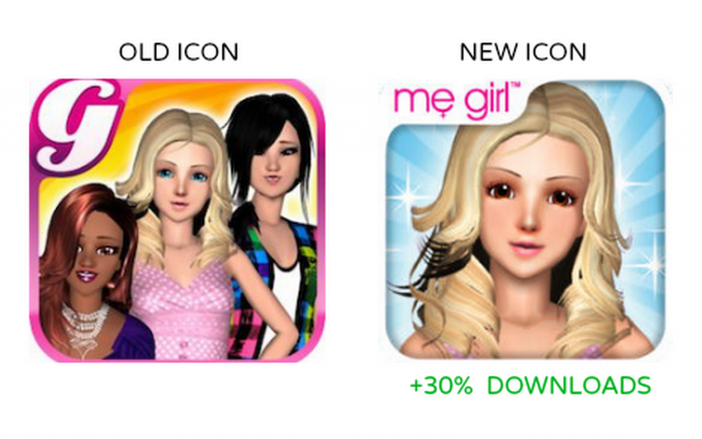
For example, a game developer Frenzoo replaced its icon for one of their fashion titles, resulting in a more than 30% increase in daily downloads on a sustained basis:
 Compared to the effort of developing a great app, it’s low hanging fruit. Following are 6 best practices on how to make an app icon.
1. Make your icon memorable
With increasing competition, it’s important to make your app icon stand out from the crowd. This doesn’t mean just a beautiful and professional graphic – you can be generic but still beautiful. It means going with a more unique and iconic look.
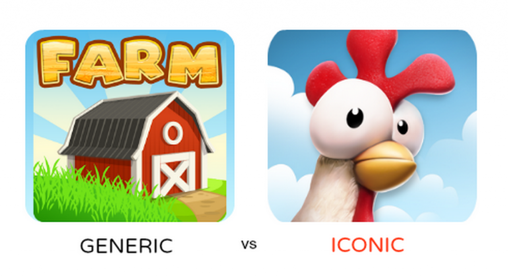
Hay Day skipped the usual assortment of farmyard imagery and went for a clean striking closeup of one of its animals, resulting in one top performing icons in the app store.
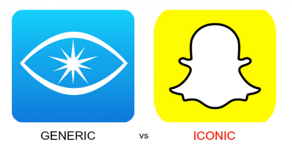
In the disappearing messaging space, Snapchat stands out through its vivid icon against some of its more generic competition.
2. Focus on one idea
The best performing icons usually focus in on one element or concept, even if the actual app contains different or varied gameplay or functionality.

The temple run icon has achieved cult status.
It doesn’t explain what it is (an endless running game) but instead conveys a single idea – treasure hunting – and brings it to life with a lot of personality and style.
Following is an example of an icon that tries to do too much, and in the end confuses.

Contrast it with Farmville 2 which runs with a plain background and puts all attention on the adorable character. It’s single idea is – cute farm animals (that you take care of).
Users scan quickly and overloading them with multiple concepts is a recipe to lower the click through rate.
Keep it simple.
3. AB test your icons
What looks good to one person may not appeal to another.
It’s important to start with a bunch of options and use a scientific approach to narrow down from a list of candidate icons down to the single winner.

This can be multi-step, for example:
- Determine the best layout
- Determine the best character or subject to use
- Determine the best style etc
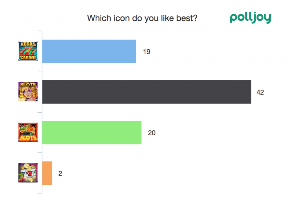
How do you perform the tests?
The easiest approach is to use an image survey tool like polljoy (mobile in-app) or surveymonkey or pollfish (desktop web).
These tools let users to choose which one they find attractive. Some have the ability to give virtual currency to survey recipients which can be useful for games.
An alternative is to do paid ad testing on networks such as Chartboost or Facebook. This requires more time as ads must go through a manual approval process and will cost several hundred dollars to gain statistical significance.
4. AB test your competition
Even before diving in to design and test your icons, it can be helpful to see what type of style and approach the target audience prefers.
5. Follow the Apple and Google guidelines
Both major app-stores publish their best practices and design guidelines for app developers and it’s recommended to read them in detail – Apple and Google.
Following is a summary:
For Apple
- For the best results, enlist the help of a professional graphic designer
- Use imagery that people will easily recognize
- Embrace simplicity
- Create an abstract interpretation of your app’s main idea
- If you want to portray real substances, do it accurately
- Make sure the app icon looks good on a variety of backgrounds
- Avoid transparency
- Don’t use iOS interface elements in your artwork
- Don’t use replicas of Apple hardware products in your artwork
- Don’t reuse iOS app icons in your interface
For Google
- Make sure that your icon is clearly visible on any type of background
- Use a distinct silhouette
- Three-dimensional, front view, with a slight perspective as if viewed from above, so that users perceive some depth
- Make sure your brand styling is applied to every single icon in your app
- Use color primarily for emphasis. Choose colors that fit with your brand and provide good contrast between visual components
6. Keep it fresh
A successful app can have a lifespan of months or years.
To keep things fresh, it’s a good idea to refresh and update your app icon to reflect new updates and seasonal changes. It’s a subtle reminder the app is still being developed and improved, and also re-engages prior users.
When doing this, remember to keep consistency through your icon so the users know it’s the same app – otherwise they may not find it easily when searching on their device.
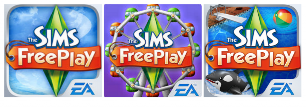
A great example is the Sims Freeplay which has updated it’s icon with major new releases, highlighting the new content but maintaining consistency.
Using these guidelines can help developers get the most out of their icon and make sure the most users possible tap the “Install” button. Remember to keep an open mind and test thoroughly – the results will show for themselves.


