Coming up with the polljoy logo was lots of fun. I mean, who doesn’t like penguins? So how to design a logo?
We decided to crowdsource the logo and created a job on 99designs. Our creative brief was simple:
“hi designer friend!
we want this logo to convey “simple” and “friendly”
have fun with it…”
On 99designs you can include sample logos — these were the ones we included, which we felt were both approachable and with personality. I’d always wanted to have an animal logo in one of my companies so many of the references included them:
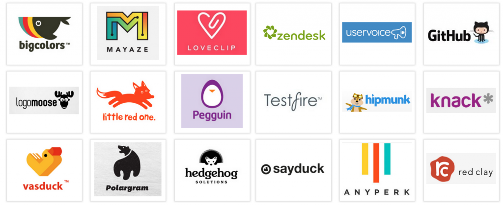
Awesome logos that we love
We also added the brand values, which is a nifty part of the 99designs process (couldn’t imagine trying to describe that all in my own words)
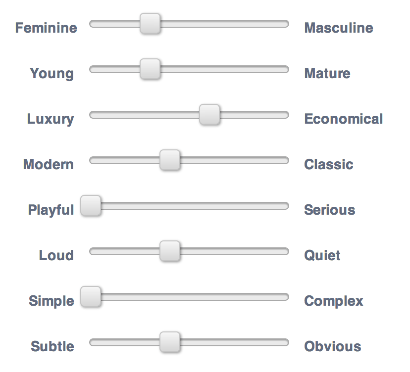
Notice the simple and playful tuned to the max!
It was surprising how many entrants we got — over 40 designers submitted a total of over 150 designs!
I think it had a lot to do with the fact our name was short and we had a fun title “Design the polljoy logo and we’ll give you a cute animal” — after all, designers like working on fun projects too.
With so many great designs to choose from, narrowing it down to a shortlist was extremely tough, taking several hours.
Finally we got it down to the 3 finalists:

In keeping with our mission, we let our users choose our logo, putting it to a vote amongst 20 developers.
Fortunately they chose the one we were rooting for ourselves — the penguin:
We love it! — The box provides a subtle link back to polls. The lowercase implies approachable and down to earth. And of course penguin looks cute and is associated with the linux / open approach we wanted to have in our culture. It also sparked more ideas for future animals (more of that in a future post)
There were two problems still though — one we only found out afterwards, was that the name is fairly easy to read at first glance as pollyjoy (doh!). To manage that, we registered that domain and have it redirecting to polljoy.com, so either way they get to the right place (where they can eventually learn the right name).
The second problem was the colour.
I’d been reading up about the psychology of color from various sources, including this great post by Leo from Buffer. We discovered the orange/red in the design was one that many men dislike.
So we looked for a different color that could appeal well to both men and women, which narrowed us down to a choice of blue or green.
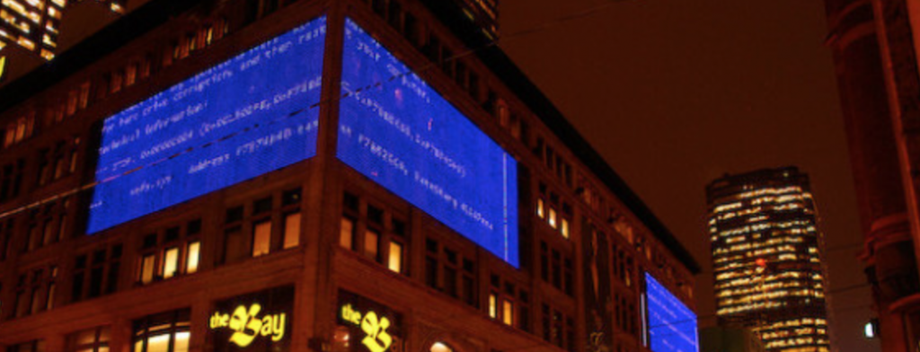
Too many BSOD memories…
We decided to go for green because of the connotation of nature (fitting in with the animal theme) and also to avoid anything related to the windows/blue screen of death — more of a personal reason.
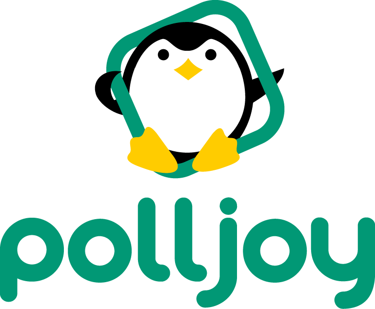
Finally here it is, our logo including our loveable mascot, polo:
That was a fun post to write! Now back to work ☺

